techkritiko@gmail.com (Jay Bonggolto)
2024-05-31 05:47:14
www.androidcentral.com
What you need to know
- Spotify’s Android app icon is updated to a borderless design, reverting to its classic look from five years ago.
- Previously, the icon had a green logo on a black background to support adaptive icons.
- The change affects devices with circular icons, filling the entire space with the Spotify logo.
Spotify is giving its Android app a facelift by ditching the border around its icon, going back to its classic look from five years ago.
Before this, the Spotify icon had a green logo on a black background. Now, thanks to Will Sattelberg of Android Police, we know the new icon is just the green Spotify logo with no black background.
Originally, the Spotify Android app featured a simple circle with the Spotify logo, just like the desktop version. But in 2019, the company added a black border to support adaptive icons that could change shape.
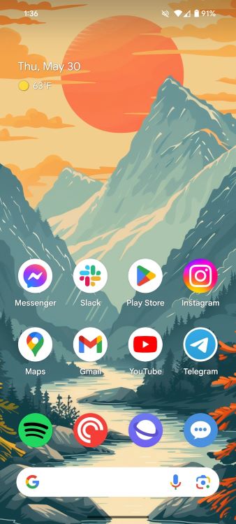
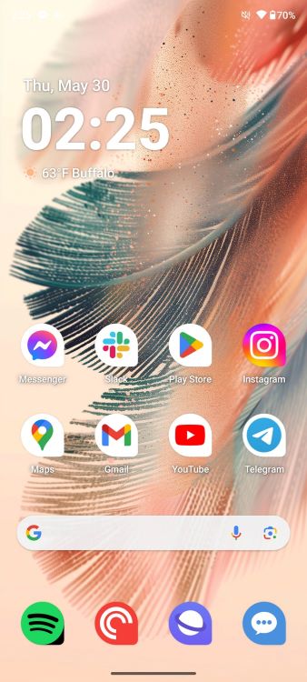
For devices with circular icons, the new design fills the entire space with the Spotify logo. It works with both unthemed and themed icons, although the themed ones don’t blend as well with other icons.
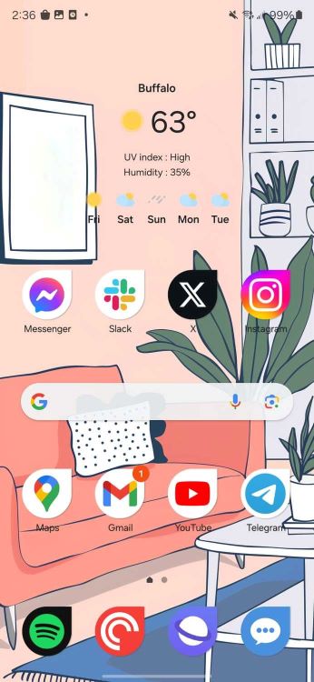
Interestingly, this change only affects devices with circular icons. If you have a Samsung Galaxy or another device with differently shaped icons, the black border will come back.
Android Police points out that on phones supporting icon shape changes, the change just zooms in on the icon, resulting in some ugly black outlines on non-circular shapes. Samsung phones, in particular, get an extra-thick border.
This isn’t a huge deal, but it’s definitely a curious change. The black background was distinctive and helped the app stand out. The new borderless version looks a bit strange, especially on phones without circular icons.
The updated Spotify icon comes with app version 8.9.44.368 and is currently only available on Android, with no changes for the iOS app icon yet.


