2024-10-14 06:00:00
www.computerworld.com
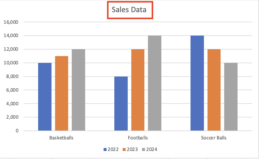
Customize the chart title: Excel typically uses the placeholder text “Chart Title” at the top of the chart, so the first thing to do is change that to something more appropriate. Double-click the chart title and type in a new name. Let’s call it “Sales Data.”

Type in a new chart title.
Shimon Brathwaite / IDG
Change, add, or remove a legend: The legend is the portion of the chart that explains what each column relates to. In our example, the legend has three items: 2022, 2023, and 2024. If you want to change these years, simply select the cell entry that corresponds to that item. For example, if you want to change 2022 to 2021, modify cell B1 and change it to 2021. The chart will auto-update. (Before we proceed with the demo, change 2021 back to 2022 again.)
If your chart doesn’t include a legend, you can add one: select the chart, go to the Chart Design tab on the Ribbon toolbar, click the Add Chart Element button, and select Legend from the menu that appears. Next, choose a location for the legend: Right, Top, Left, or Bottom. To remove a legend if you don’t want one, follow the same steps and choose None.
Support Techcratic
If you find value in Techcratic’s insights and articles, consider supporting us with Bitcoin. Your support helps me, as a solo operator, continue delivering high-quality content while managing all the technical aspects, from server maintenance to blog writing, future updates, and improvements. Support Innovation! Thank you.
Bitcoin Address:
bc1qlszw7elx2qahjwvaryh0tkgg8y68enw30gpvge
Please verify this address before sending funds.
Bitcoin QR Code
Simply scan the QR code below to support Techcratic.

Please read the Privacy and Security Disclaimer on how Techcratic handles your support.
Disclaimer: As an Amazon Associate, Techcratic may earn from qualifying purchases.


![Pioneer [Blu-ray]](https://techcratic.com/wp-content/uploads/2024/11/81EmJG9mivL._SL1500_-360x180.jpg)


![The Mysterious Origins of Man (UFO TV Special Edition) [DVD]](https://techcratic.com/wp-content/uploads/2024/11/81uncTrsXpL._SL1500_-360x180.jpg)


![Alien Stickers [200pcs] UFO Stickers for Teen, Vinyl Water Bottles Waterproof Stickers for Laptop Guitar Scrapbook Skateboard Stickers](https://techcratic.com/wp-content/uploads/2024/11/91DUuGusXeL._AC_SL1500_-360x180.jpg)


