bradypsnyder@gmail.com (Brady Snyder)
2024-11-21 13:53:00
www.androidcentral.com
What you need to know
- YouTube is testing a redesign of YouTube Music’s Now Playing screen for a number of users.
- The company last tweaked the look of Now Playing in September 2023, and is beginning to make new changes a little over a year later.
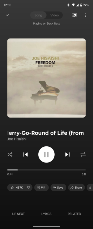
- Highlights of the changes include the main play/pause set of controls appearing directly below the album artwork and song title.
Over a year after YouTube last tweaked the Now Playing screen in the YouTube Music app, new changes may be coming. Multiple reports from Reddit users and 9to5Google indicated that YouTube Music’s Now Playing page was testing a significant shakeup, with buttons moving around and a new-look scrubber. Android Central can confirm the test firsthand, as the redesigned Now Playing screen has appeared on at least one of our devices.
Previously, the actions carousel appeared directly under the song title, artist, and album artwork. This carousel gives users access to buttons for like, dislike, comments, sharing and more. However, the new test moves the main playback controls — including play/pause, forward/rewind, and shuffle/loop — directly under the song title and artist name.

The test moves those crucial Now Playing buttons closer to the center of the screen, and the song details. It also shifts them further away from the bottom of the screen, which may cause reachability issues when using your phone one-handed. This is a unique problem for YouTube Music, because it has the actions carousel that forces the main Now Playing buttons upward or downward on the screen. Other streaming apps, like Spotify and Apple Music, don’t have this problem because they don’t have an actions carousel or equivalent.
Additionally, the timeline is redesigned, taking cues from the main YouTube app. It’s now a rectangle without a visible dot for the scrubber. Instead, the scrubber will appear if you try and hold and drag along the timeline to skip or go back. It’s a more minimalist design that will feel familiar if you’re used to other Google timeline scrubbers.
Of course, since the Now Playing buttons are moved up, the actions carousel must be moved down. It’s now in between the up next/lyrics/related buttons at the very bottom of the screen and the main Now Playing buttons.
While these changes may take some getting used to, it has been a while since YouTube Music updated its Now Playing screen, so maybe it was time for a tweak or two. This seems to be a somewhat limited test for now, and we’re not sure when it might roll out to all YouTube Music users. You might have to wait and hope you get lucky, like those YouTube Music users who got their Rewind stats early.

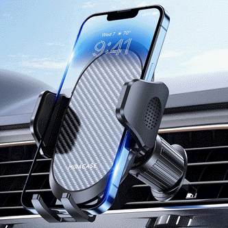
Keep your phone secure and easily accessible in your car with the Miracase Phone Holder for Your Car! This Amazon Best Seller is designed for easy installation and holds your phone firmly in place, ensuring a safe and convenient driving experience.
With a 4.3/5-star rating from 29,710 reviews, it’s a top choice for drivers! Plus, over 10,000 units sold in the past month! Get it now for just $15.99 on Amazon.
Source Link
Support Techcratic
If you find value in Techcratic’s insights and articles, consider supporting us with Bitcoin. Your support helps me, as a solo operator, continue delivering high-quality content while managing all the technical aspects, from server maintenance to blog writing, future updates, and improvements. Support Innovation! Thank you.
Bitcoin Address:
bc1qlszw7elx2qahjwvaryh0tkgg8y68enw30gpvge
Please verify this address before sending funds.
Bitcoin QR Code
Simply scan the QR code below to support Techcratic.

Please read the Privacy and Security Disclaimer on how Techcratic handles your support.
Disclaimer: As an Amazon Associate, Techcratic may earn from qualifying purchases.


![Trolls Holiday [DVD]](https://techcratic.com/wp-content/uploads/2024/11/718ptSfcL._SL1500_-360x180.jpg)


![Ted Lasso: The Richmond Way BD [Blu-ray]](https://techcratic.com/wp-content/uploads/2024/11/71IXM3sX7-L._SL1500_-360x180.jpg)


![Alien 3 [Blu-ray]](https://techcratic.com/wp-content/uploads/2024/11/91YlnAd8ibL._SL1500_-360x180.jpg)


