


2025-04-20 02:00:00
www.androidcentral.com
This week, Google announced that Chrome for Android would finally move the address bar to the bottom of the screen. I say “finally” because the iOS version of Chrome has had it for two whole years. Many people rejoiced at this change, but I’m happy for a very different reason: Google isn’t forcing me to use something I can’t stand.
That’s right. If you’re like me, you can simply press and hold the address bar and drag it back to the top, where it belongs. Other popular browsers, such as Microsoft Edge for Android and the Samsung Internet Browser, already allow users to choose where they want the address bar, and I appreciate it when users have a choice in their UI design.
What I don’t like is having buttons on the bottom of my screen. I rejoiced when gesture-based navigation made its official Android debut in Android 10, giving all phones the ability to get rid of those pesky navigation buttons on the bottom of the screen. Then, app developers had to muck it up by moving all the buttons in their apps down to the bottom.
Tabs at the top, please

As AC’s Jerry Hildenbrand so eloquently put it this week when we were having the discussion about buttons on the bottom, “any phone with a screen bigger than 4 inches needs buttons on the bottom.” The idea is that bottom-aligned buttons are easier to reach than ones at the top, something Steve Jobs and co. agreed with in the first iPhone release.
The problem is that this is only partially true. The original iOS release standardized navigation buttons/tabs for apps at the bottom of the screen because the original iPhone’s screen was positively tiny by modern standards. Everything on the original iPhone’s display was reachable with your thumb, including the back button on the top-left corner of the screen, something absolutely no phone can claim today.
If I try to open my phone app from the home screen with one hand, it’s already literally impossible. The OnePlus 13 I use as my daily driver has a display that’s simply too wide for my thumb to reach across to the phone icon, and that’s on the bottom-left corner of the screen. No amount of finger gymnastics makes it possible to touch this icon without grabbing the phone with my other hand to stabilize it.
Alright, now that the phone app is open, I realize it defaults to “Recents,” which is the tab in the middle. If I wanted to access the “Favorites” tab, I would once again have to stabilize the phone with my other hand and then click it. This defeats the entire purpose of bottom-aligned navigation buttons.
If we look back at the Android 4.0 days, I’m reminded of how much better the “tabs at the top” design was, if only for one reason: you could swipe between them. Some of my arguments against bottom-aligned navigation buttons would be negated if developers went back to letting us swipe between tabs. Head to the 4:56 timestamp in this Galaxy Nexus UI tour video and you’ll quickly see what I mean.
This isn’t the only thing people have wanted brought back in recent years. Clicks cases are bringing physical buttons back. The best multitasking UIs ditch the iOS 10-inspired Overview screen for something much more efficient and, ironically, older. I could go on with other examples, but you get the point.
Bottom-aligned buttons also take up unnecessary space in a more important part of the screen. We can make fun of it all we want — and we have — but Apple’s decision to put The Notch™️at the top of the iPhone’s display was because people’s natural vision cancels out static elements at the top of a screen, not the bottom. Ask most iPhone owners, and they’ll tell you they don’t even notice the notch.
But rotate an iPhone and you’ll suddenly see that big honkin’ chunk missing from the display. It’s not like we don’t have plenty of screen real estate, but there’s no reason I need to be looking at static buttons all the time at the bottom of an app. It’s a silly use of space.
I would love to be given the choice of moving those bottom-aligned buttons back to the top, where I feel they belong. Chrome tabs are at the top. Old-school paper folder tabs are at the top. Some apps, like Google Drive, use a combination of swipable top tabs in conjunction with bottom-aligned buttons.
As usual, what I want is the freedom of choice for these UI elements. Many people love bottom-aligned tabs, buttons, and address bars, but I certainly don’t, and I dislike being forced to use them.
Anyways, thank you for listening to my TED Talk. I’ll see you all next week.
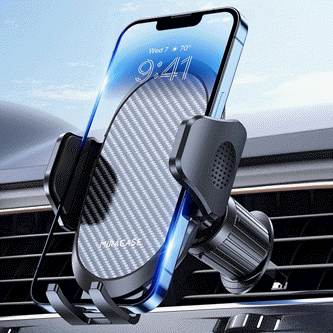
Keep your phone secure and easily accessible in your car with the Miracase Phone Holder for Your Car! This Amazon Best Seller is designed for easy installation and holds your phone firmly in place, ensuring a safe and convenient driving experience.
With a 4.3/5-star rating from 29,710 reviews, it’s a top choice for drivers! Plus, over 10,000 units sold in the past month! Get it now for just $15.99 on Amazon.
Help Power Techcratic’s Future – Scan To Support
If Techcratic’s content and insights have helped you, consider giving back by supporting the platform with crypto. Every contribution makes a difference, whether it’s for high-quality content, server maintenance, or future updates. Techcratic is constantly evolving, and your support helps drive that progress.
As a solo operator who wears all the hats, creating content, managing the tech, and running the site, your support allows me to stay focused on delivering valuable resources. Your support keeps everything running smoothly and enables me to continue creating the content you love. I’m deeply grateful for your support, it truly means the world to me! Thank you!
|
BITCOIN
bc1qlszw7elx2qahjwvaryh0tkgg8y68enw30gpvge Scan the QR code with your crypto wallet app |
|
DOGECOIN
D64GwvvYQxFXYyan3oQCrmWfidf6T3JpBA Scan the QR code with your crypto wallet app |
|
ETHEREUM
0xe9BC980DF3d985730dA827996B43E4A62CCBAA7a Scan the QR code with your crypto wallet app |


Please read the Privacy and Security Disclaimer on how Techcratic handles your support.
Disclaimer: As an Amazon Associate, Techcratic may earn from qualifying purchases.


