


William Gallagher <wg@williamgallagher.com>
2025-09-11 08:54:00
appleinsider.com
Liquid Glass will briefly startle you, but then it’s the new features in macOS Tahoe that make this a significant and a significantly useful upgrade.
Each year AppleInsider does an immediate review of the latest macOS as it comes out in beta, and then a final, definitive one as it is officially released. But macOS doesn’t stop being developed when it is released, and that’s especially so with macOS Tahoe because of Liquid Glass.
This is the big visual change to macOS and we’ve already seen it change during the beta process. Those changes were primarily Apple toning Liquid Glass down such that it isn’t as big a visual change as it was.
That’s going to continue over the next many years and many versions of macOS, but even solely with macOS Tahoe, we’re going to go through some months of further changes. Developers will revise their apps to use the new design and it will highlight both benefits and problems that Apple will respond to.
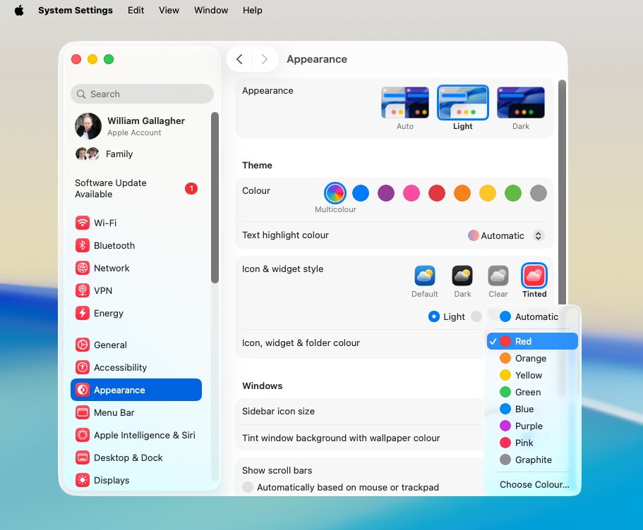
The Dock can now have four broad options such as Clear or Tinted, and if you chose the latter, you can set the tint color
Yet if it feels more than ever that macOS is in flux, solely focusing on it as it is on day one of its official release, you can make some definitive conclusions.
The new macOS Tahoe is an excellent update, but Liquid Glass is not a revolutionary change. Liquid Glass is startling at first, but then very soon you see it as less of something new to understand, and unfortunately more like a new skin laid over the old OS.
macOS Tahoe review — Liquid Glass
That’s not to say that Liquid Glass is in any serious way bad, or that it isn’t a welcome refresh. It also is not to say that it doesn’t bring significant benefits to the Mac.
But it is to say that it isn’t as earth-shattering as Apple described in the launch at WWDC 2025.
Every year, there is some visual difference in macOS, or there are some new features, and the result is the same. While you transition to it and are perhaps still using last year’s macOS on one Mac, you very, very soon want to be using the new one everywhere.
You even very, very soon wonder how you put up with the old macOS, the new one is so much better.
Yet purely personally, this is a year with a purported seachange in the look and feel of macOS, and I haven’t felt that urge to update everything. I have a Mac Studio on macOS Tahoe and a MacBook Pro on 2024’s macOS Sequoia, and switch between them without thought.
Maybe that’s just me, though, because Liquid Glass does bring specific changes and they are good.
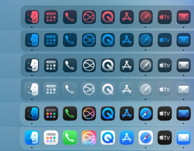
Just some of the Liquid Glass options for the Mac’s Dock
At first, the visual change appears to concentrate on making everything liquid, on making everything refract as if under a bubble of glass. But it soon becomes clear — pun not intended — that the real aim is to make the Mac serve your work and your concentration.
It’s about getting out of your way. So while Apple’s original idea of a totally invisible menu bar has gone, worn away by complaints during the beta, it’s still less in your face.
Only by a little. It’s now a translucent bar and depending on your wallpaper, it may not even seem that translucent. But it isn’t solid white anymore, it doesn’t make quite the same definite barrier at the top of the screen.
Then at the bottom, by default, there is just a little moving away from highlighting Mac features. The Dock has also become translucent, and much more so than the menu bar.
App icons have also changed to — in theory — make them easy to spot but less prominent, less distractingly taking up space. They’re a little neater, they have some redesigns, and eventually the Dock is going to look tighter, it’s going to look like it is making better use of the space.
It doesn’t right now, though, because so many third-party apps have had their icons altered by Apple. It’s the same icon, but inset in a grey box so that, overall, they match the size and orientation of the new ones.
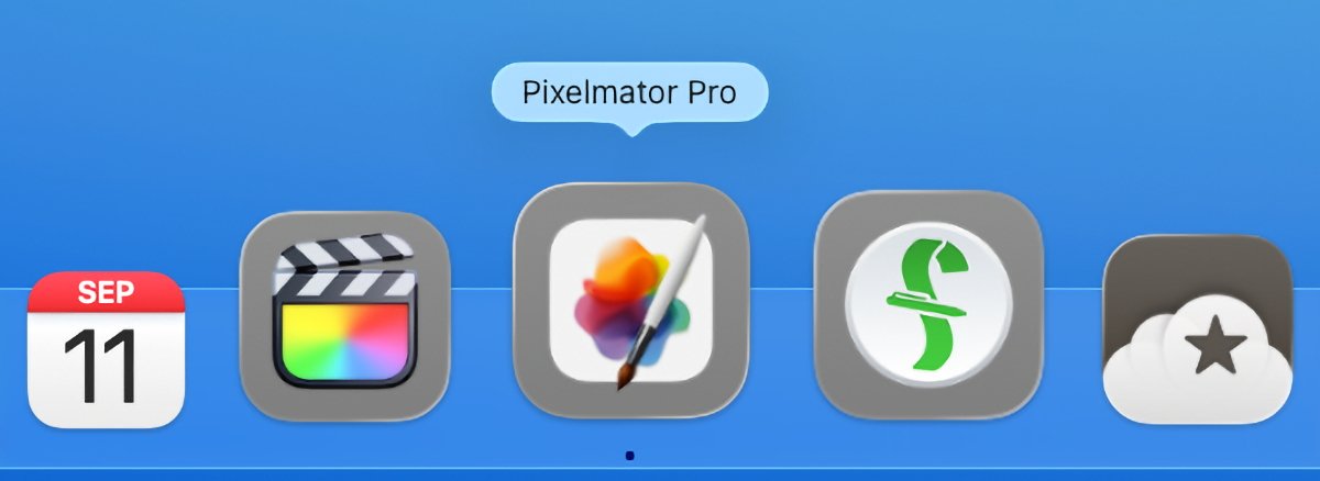
Notice that Apple’s own Final Cut Pro (second from left) does not get a proper Dock icon, and nor does Apple-owned Pixelmator Pro (center). but third-party apps Fantastical (far left) and Reeder (far right) do.
That will change as developers do whatever it is they have to in order to return to full-size Dock icons. For now, though, it does make finding the app you want slightly less convenient.
Unless, that is, you turn on Liquid Glass’s feature whereby every app in the Dock becomes clear and translucent. When you do that, the apps imprisoned in a box are close to impossible to spot.
They’ve already lost their distinctive look by being inset, and now with color removed too, you have to search through the Dock to find them.
This has improved since the very first beta, though, and especially when apps are developed and get the new icons, it will work better. Plus clear app icons on a translucent Dock is appealing — both just aesthetically, and because of this aim of concentrating on your work.
With the Dock and its apps see-through, and the menu bar at least more see-through than before, the effect is that the Mac’s tools fade away. Whatever you’re working on, that is what is the most prominent on the screen — and that is a good feature.
macOS Tahoe review — Liquid Glass in the Finder and apps
In between the Dock and the menu bar, you tend to have Finder windows open and they are now more rounded. Plus the current folder is highlighted in blue in the list of them on the left hand side.
The effect is that Finder windows are more prominent than they were before. It’s like Apple has kept their neatness, such as the small size of the font on all folder names, but made them stand out more.
It’s a very subtle change. Where the left hand navigation column used to be a solid gray bar, it’s now a round-edged gray set inside the column.
Notice how the top toolbar buttons are subtly clearer because of their white bubbles. Also that the current folder is highlighted in blue in the sidebar.
Where tools across the top used to be icons in the light gray background, they are now each in their own small, white bubble. It means they are more distinctive, without being more distracting.
So where the Dock and the menu bar can stay out of your way, when you choose to open a Finder window, you get clear, quick controls.
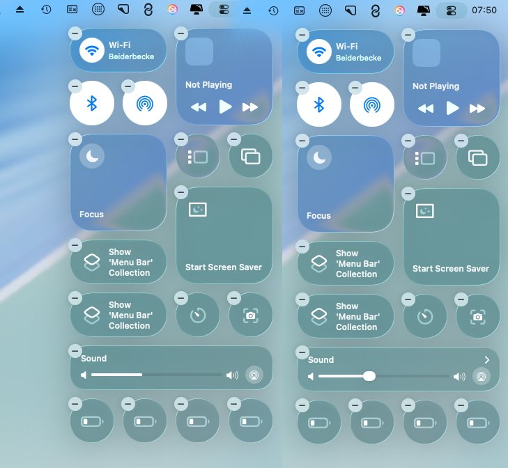
With the same aim and yet just a fraction less subtle in its design, Liquid Glass changes sliders within apps and Control Center. The slider that you grab is now usually bigger than before, it presents a larger target, and that can look a little bulbous.
It can seem cruder, really, as the finer slider becomes this bigger blob. But it makes grabbing the slider much quicker, and then as you drag to slide, all the same fine movements are there.
That isn’t consistent, though. For Control Center, there is the nice effect that the volume slider does not appear at all until you mouse over it. Then it’s big.
If you use the volume control on your keyboard, you now get a matching sliding bar toward the top right of the screen. It’s closer to being like a notification and is much better than the center-of-the-screen large graphic we had before.
Once you’ve pressed volume up or down on the keyboard and got that slider on screen, then you can move your mouse to it. You have to be quick or it goes away, but if you are, then the slider appears under your cursor the way it does in Control Center.
Notice the volume control at the bottom: left: not hoverred over, right: being dragged
Curiously, during the initial first few betas, this on-screen volume control would also appear if you were using a Stream Deck instead of the keyboard. That doesn’t appear to still be the case.
That’s an example of a small oddity in the new Liquid Glass, an oddity that points to how it’s all being worked on continuously.
Another is that Apple has restored keyboard controls to certain dialog boxes. This also wasn’t consistent, but there were dialogs where you had to click to select instead of typing the first letter of your choice.
It’s a tiny thing and was annoying only if you even noticed it, but it’s points to how the Liquid Glass redesign actually reaches deeper into macOS than it seems. Every part of the OS has been looked at, it appears, and most of it revamped.
Yet it’s still not the reason to upgrade to macOS Tahoe.
macOS Tahoe review — new Spotlight
One reason to upgrade is that you always should because of security features. If your Mac can run the latest macOS, you should update to it.
But beyond that practicality, this time there are key reasons to upgrade, there are key benefits. And two of them are in Spotlight.

Spotlight now blobs out into more options, including clipboard history
Right back when macOS Tahoe was unveiled, the clear and most startlingly unexpected element was the addition of a clipboard history to Spotlight. Just as you’ve been able to do on Macs with third-party tools for three decades, you can now have a more powerful copy and paste.
So instead of the familiar copying something, then pasting it somewhere, then copying something else, you could do more. You don’t have to, copy and paste still works as it always has, but you can copy ten things in a row and then paste back any one of them you like, in any order.
A clipboard manager is utterly indispensable once you’ve used one and, no question, Apple adding this to Spotlight is a huge thing.
Except as the beta went on, it became apparent that Apple has done its usual thing of finding a middle ground. Spotlight’s clipboard history is not quite as easy to use as regular copy and paste, and it’s not as powerful as those third-party rivals.
It’s exactly the same as how Reminders is quite remarkably powerful and will suit the giant majority of people — but no one will quit OmniFocus, Things 3, or Todoist for it.
In this case, the specific problems start with how it takes several steps to get to the clipboard history. You have to launch Spotlight with Command-Space, then press Command-4 to get a series of blob controls and move over to the right one for the clipboard.
Compare that to, say, Alfred 5, where a single keystroke takes you to your clipboard history. This needing to take extra clicks means the clipboard history will be missed by many users.
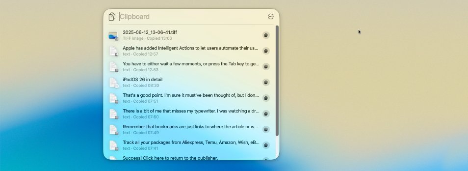
Clipboard history is limited, but just being available at all is a big deal
So it’s there, the feature is present and it is excellent, but Apple has chosen to make you have to look for it. And Apple has also chosen to make third-party clipboard managers look better.
That’s specifically because of a security issue. Rival third-party clipboard apps have long solved the issue of handling passwords — they let you copy and paste them, but they don’t then keep them in the history.
Apple has somehow not done that. Instead, the first time you use Spotlight’s new clipboard history, Apple warns you that you could have sensitive information on there.
And Apple also wipes the clipboard history after eight hours, rendering it close to worthless. There’s no pasting the note you made last night, there’s no retrieving that website URL you copied last Tuesday.
What Spotlight does have, though, is a quite brilliant new feature called Quick Keys. This does also take the same number of clicks or keystrokes to get to, but from there you can launch potentially hundreds or maybe even thousands of Mac features by typing just a couple of keys.
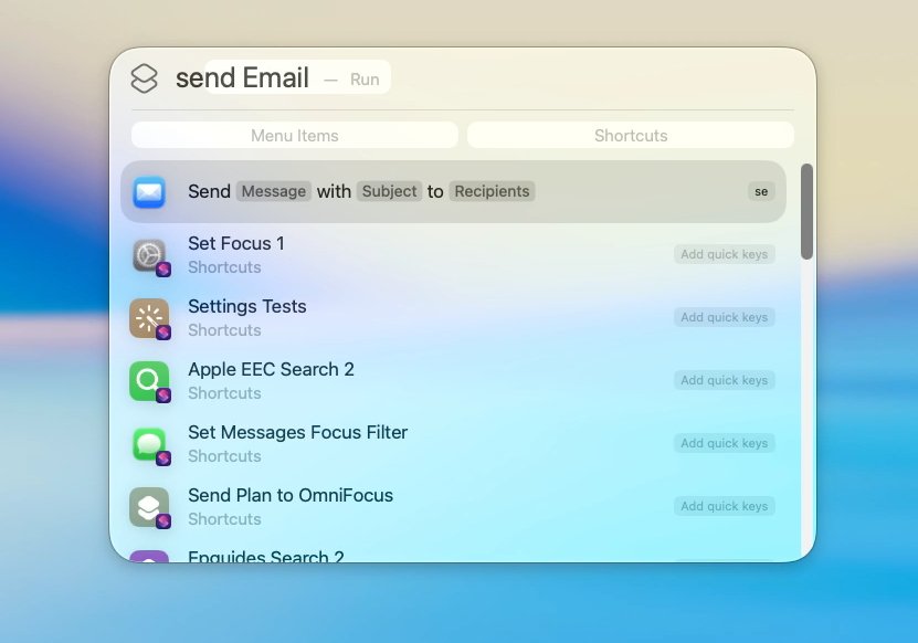
Here the letters “SE” have been set to “Send Email”, but they can be changed to anything
The features depend on what apps you have on your Mac, but even if you only had what Apple provides, you seem to have countless options. You can send a Message or an Email by opening Spotlight, choosing the Actions section and typing a couple of characters, for instance.
You decide on those characters, so you could, for example, decide that typing the letters “SE” means that Spotlight should Send an Email.
Fine, that’s immediately faster than opening the Mail app and choosing New Email.
But the benefit goes beyond this. If you did that opening of the Mail app then the odds are that you wouldn’t be able to close it again without seeing and responding to new emails that have arrived.
With Quick Keys, though, you can compose the email, address it, and send it, all within Spotlight. You don’t see any new inbound messages because you don’t see the Mail inbox.
It’s a little limited in that this is not the way to send attachments or any complex formatting. But for sending quick email or a quick Message, it’s unbeatably fast, and unbeatably able to keep you focused on the work you want to do.
macOS Tahoe review — Live Activities and Phone
In theory, the new macOS Tahoe also cuts down on distractions by making your iPhone less necessary. You still have to have it, and you still have to have it near you, but Apple wants you to be able to leave it in a pocket or on the desk, instead of constantly picking it up.
So while you have to pick up the iPhone — or use iPhone Mirroring on the Mac — to start something like flight tracking or ordering an Uber, you can then put it down. Anything that triggers Live Actions on the iPhone now gets those same Live Actions for you on the Mac.
They live in the menu bar as a very small icon. But you can click on that to get a pop-out that shows more details — and you can click on those details to open up iPhone Mirroring and see even more.
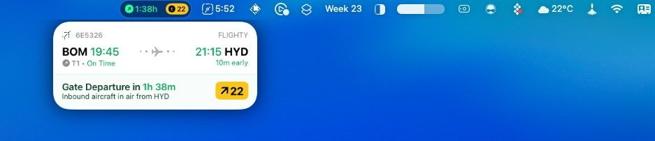
Live Activities on the iPhone, but shown on the Mac
This all works and all works well. It’s the other main aspect of iPhone control that is more disappointing.
Macs now have a Phone app, and in theory as long as you’ve got a microphone and speakers on your Mac, you don’t need to physically pick up the iPhone. You can answer calls on the Mac, you can place calls too.
It ought to be a boon and hopefully it will be, but it isn’t yet. For some unfathomable reason, the Phone app has proven inconsistent in tests — sometimes the person you’re calling just can’t hear you.
And every time the phone rings, you get a notification that includes a Reject Call button that doesn’t work. The notification itself is quite slow, but when it’s on screen, you can stab away at the red button all you like, nothing is going to happen.
It’s the promise of how useful this would be that makes it failing to be any good so frustrating.
This is the experience AppleInsider has had during the beta process, so hopefully now the final release is out, it will be better. But this was one element of the beta that did not change throughout the months of updates.
macOS Tahoe review — Journal
Whereas one thing that did change was that the new Journal app seemed to improve. The stand-out feature of Journal is that it exists at all, after some years of only being on the iPhone.
It’s still really an iPhone-first app, with Journal for iOS being much better at automatically plugging in to everything you’ve been doing in the day. But then nothing beats the Mac for being able to actually type journal entries.
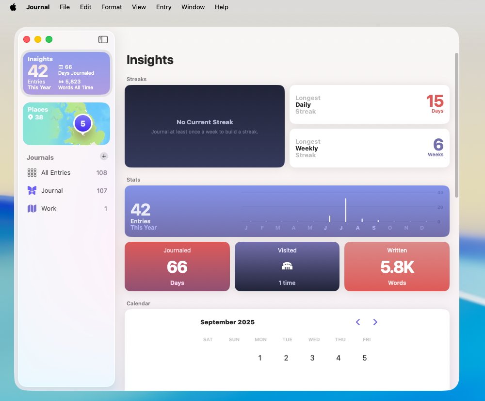
Journal for Mac is not as full-featured as on iOS, but it’s great to be able to type into it now.
What was initially an issue and may yet be so the first time you launch Journal on the Mac, is syncing. Throughout the beta process, this would look as if it had failed because Journal on the Mac would not show any entries at first.
Leave Journal for Mac open for a few hours, though, and it does all sync up. After that, if it’s slow to sync new entries between Mac, iPhone, and iPad, it isn’t slow enough to notice.
macOS Tahoe review — niche but great Shortcuts
Shortcuts on macOS Tahoe may be both the most frustrating and have the best new addition — if only for a very small fraction of Mac users. Yet the new addition could well be enough to bring more people into becoming Shortcuts addicts.
For Apple has given Shortcuts new actions, new features, to do with Apple Intelligence. Some of them are just the Writing Tools that are not of any interest, but one called “Use Model” is very significant.
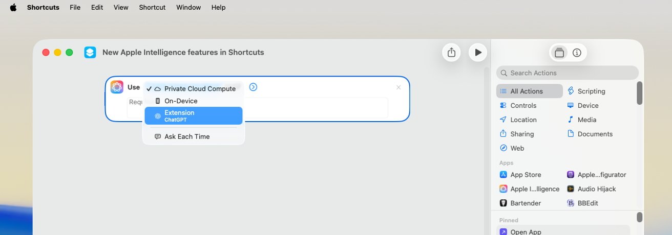
Just one “Use Model” action in Shortcuts makes Apple Intelligence more useful
“Use Model” is the way you can get a Shortcut to use Apple Intelligence for you. For one example, I now have a Shortcut that asks me for two PDFs and then, using Apple Intelligence, compares them.
Or I continually use another where I select a text list and have Apple Intelligence reformat it unto a HTML list for me.
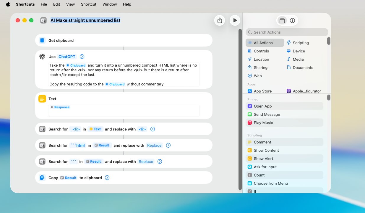
Using Apple Intelligence to format a HTML list
These all bring up oddities in AI, though. You expect to get the same result every time you run an AI feature, but often enough, you don’t.
That HTML list example, for instance, just sometimes comes out slightly wrong.
It also points out differences in the different flavors of AI available to us through Shortcuts. For any “Use Model” action you choose, you can decide whether to use:
- Private Cloud Compute
- On-Device
- Extensions (ie ChatGPT)
The first means using Apple Intelligence in the cloud, the full-strength Apple Intelligence. The second means using a smaller subset of Apple Intelligence actually on your Mac, iPhone, or iPad.
And the third means using ChatGPT, but sending it a request via Apple Intelligence so that your privacy is assured. There will be other extensions at some point, most likely starting with Google Gemini.
So you chose between these, and you get different results when you do. It’s a matter of finding the one that gets you the best result, and that can be fiddly.
It can also be impossible. That HTML list now works perfectly when I select that I want an unnumbered one. But if I want the list numbered, or I want it sorted into alphabetical order, then the final result will be slightly off.
I might get, say, ChatGPT’s commentary about what a wonderful list I’ve written. Or I might get some stray formatting characters.
The same Shortcut code will also just sometimes fail with a time-out error.
So it’s not exactly a perfect new feature, yet having a “Use Model” action in Shortcuts has transformed how often I use Apple Intelligence.
But then if I could talk to the Shortcuts team — and I’ve tried via Apple’s beta feedback — I would be on my knees asking them to fix Safari Tab Group shortcuts. On the iPhone and the iPad where it hardly matters, you can automate switching between tab groups in Safari, and on the Mac, you only think you can.
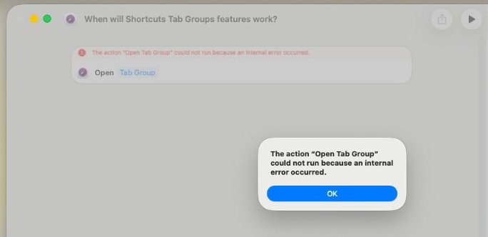
This still happensThis still happens
The feature is there, the action is now available on the Mac version of Shortcuts. And for one glorious minute around developer beta 5 of macOS Tahoe, it worked — once.
Before and since, I run that action and it fails with “an internal error.”
macOS Tahoe review — system requirements
The new macOS Tahoe runs on Apple Silicon M1 Macs or later, and on certain Intel Macs. The complete list of compatible Macs is:
- iMac (2020 and later)
- Mac mini (2020 and later)
- Mac Pro (2019 and later)
- Mac Studio (2022 and later)
- MacBook Air with Apple Silicon (2020 and later)
- MacBook Pro 13-Inch (2020, Four Thunderbolt 3 Ports)
- MacBook Pro 16-Inch (2019)
- MacBook Pro with Apple Silicon (2020 and later)
Note that this is the last year that any Intel Macs will be supported beyond security updates.
As with recent macOS updates, Intel Macs already get a more limited feature set. While this could conceivably change over the beta process, at present Intel Macs will certainly not get:
- Apple Intelligence Writing Tools or Shortcuts actions
- Live Translation
- Polls in Messages
macOS Tahoe review — pros
- Improved Spotlight with clipboard manager
- Spotlight Quick Keys
- New Phone app has potential
- Apple Intelligence actions in Shortcuts
- Liquid Glass makes controls clearer
macOS Tahoe review — cons
- Transparent dock makes selecting apps harder
- Journal is barebones
- Shortcuts still lacks parity with iPhone in key actions
Ultimately, Apple will declare victory, and report a big number for adoption within 30 days or 90, or some such. It will be in the 80% range, and that will be the end of talking about upgraders for them, other than updates through the year.
As always, if you have an application you can’t live without, we recommend you let others get failure points for you. While this seems like an update that breaks less software than others have in the past — we’re looking at you, migration to APFS — there will always be edge cases.
But for most, though, Tahoe is a solid update. That is, assuming you like the Liquid Glass redesign.
Rating: 4 out of 5
Keep track of your essentials with the Apple AirTag 4 Pack, the ultimate tracking solution for your belongings. With over 5,972 ratings and a stellar 4.7-star average, this product has quickly become a customer favorite. Over 10,000 units were purchased in the past month, solidifying its status as a highly rated Amazon Choice product.
For just $79.98, you can enjoy peace of mind knowing your items are always within reach. Order now for only $79.98 at Amazon!
Help Power Techcratic’s Future – Scan To Support
If Techcratic’s content and insights have helped you, consider giving back by supporting the platform with crypto. Every contribution makes a difference, whether it’s for high-quality content, server maintenance, or future updates. Techcratic is constantly evolving, and your support helps drive that progress.
As a solo operator who wears all the hats, creating content, managing the tech, and running the site, your support allows me to stay focused on delivering valuable resources. Your support keeps everything running smoothly and enables me to continue creating the content you love. I’m deeply grateful for your support, it truly means the world to me! Thank you!
|
BITCOIN
bc1qlszw7elx2qahjwvaryh0tkgg8y68enw30gpvge Scan the QR code with your crypto wallet app |
|
DOGECOIN
D64GwvvYQxFXYyan3oQCrmWfidf6T3JpBA Scan the QR code with your crypto wallet app |
|
ETHEREUM
0xe9BC980DF3d985730dA827996B43E4A62CCBAA7a Scan the QR code with your crypto wallet app |


Please read the Privacy and Security Disclaimer on how Techcratic handles your support.
Disclaimer: As an Amazon Associate, Techcratic may earn from qualifying purchases.


